
The Well-Oiled Gate: The Rural Business Guide to UX and Conversion Rate Optimization
Stop losing high-ticket customers on your own digital property.
Let’s look at the blueprints
Introduction: The Rusty Wire Gate vs. The Steel Latch
Imagine a customer driving to your ranch to hand you a $50,000 check. They pull up to the property line, but your front gate is a tangled mess of rusty barbed wire, tied off with baling twine, and half-buried under three feet of snow. They wrestle with it for five minutes, tear their gloves, get frustrated, and ultimately throw it back in the dirt. They get back in their truck and drive to your competitor down the road.
If your website is hard to navigate, slow to load, or confusing to read, this is exactly what you are doing to your digital traffic.
You spend hard-earned money and time driving people to your website. But if the gate is stuck, they aren’t coming in. In the digital world, fixing that gate comes down to two academic concepts that we need to translate into plain English: UX (User Experience) and CRO (Conversion Rate Optimization).
Think of your website like a piece of heavy equipment. UX is the engineering of the cab—making sure the controls make sense, the seat is comfortable, and the visibility is clear. CRO is the engine tuning—making sure the machine actually harvests the crop efficiently and puts money in the bank.

In the tech world, UX stands for “User Experience.” At its core, it is the science of designing a system based entirely on human needs, behaviors, and motivations.
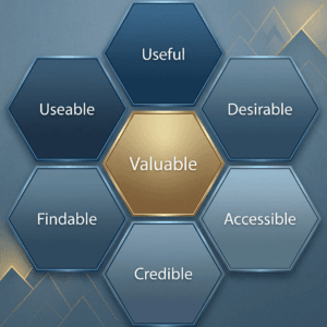
- Useful: Does this page actually answer the customer’s question, or is it just corporate fluff? If your “Services” page doesn’t explain what you do, it isn’t useful.
- Usable: Is the site functionally sound? Can a 60-year-old rancher navigate your dropdown menus with calloused thumbs on a cracked iPhone screen?
- Findable: Are the most important things obvious? Your phone number, service area, and core offering should be visible within three seconds of the page loading. We call this visual hierarchy—guiding the eye exactly where it needs to go.
- Credible: Does the site look like a legitimate, professional outfit? Broken links, pixelated photos, and typos scream “fly-by-night scam.” High-quality, authentic design builds instant trust.
- Desirable: Does your brand voice and imagery make them want to work with you? This is where your rugged, authentic Rural Mountain Media branding separates you from the sterile, corporate competition.
- Accessible: Can everyone read your content? This means high-contrast text (no light gray font on a white background) and clear, legible fonts that don’t require a magnifying glass.
- Valuable: At the end of the day, does the website save you time (by answering FAQs) and make you money (by generating leads)? If it doesn’t yield a return, it’s a liability, not an asset.
When you nail these seven factors, you remove the friction. You make doing business with your company feel easy, natural, and reliable before you ever shake hands.
If UX is about making the cab comfortable for the driver, CRO (Conversion Rate Optimization) is about making sure the machine actually harvests the crop.
Let’s get one thing straight right out of the gate: “Conversion” is just the Silicon Valley word for “getting a signed contract,” “making the phone ring,” or “getting paid.”
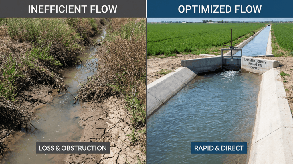
You can spend thousands of dollars on SEO and ads to drive traffic (water) to your website. But if your site is a cracked, muddy ditch, that traffic just soaks into the dirt. They read a page, get confused, and leave. CRO is the process of lining that ditch with concrete so every single drop of traffic flows exactly where you want it to go: your bank account.
Here is the hard science behind how we make that happen.
You don’t guess if your engine is running hot; you check the gauge. Professional CRO replaces gut feelings with hard math, heatmaps, and continuous A/B testing to mathematically prove what makes the phone ring.
[Layout Note: Section Transition]
Please create a split graphic image to illustrate clean flow of website traffic. The left side is a high quality photo of a muddy, overgrown, unlined irrigation ditch where the water is seeping into the dirt. The right side high quality photo is of a clean, engineered larimer county farm irrigation canal like those you see in Larimer County showing water flowing rapidly and perfectly into the field.
- Visual Suggestion: A split-screen or dual graphic. On one side, a close-up of a hand shifting the smooth, modern controls inside the cab of a new John Deere tractor (representing UX/Comfort). On the other side, a massive grain cart overflowing with the harvest (representing CRO/Payload).
- Caption: UX is the comfortable cab. CRO is the overflowing grain cart. Together, they are the synergy of a working digital asset.
Part 3: The Synergy (Where Comfort Meets Payload)
We have talked about UX (making the site easy to use) and CRO (making the site generate leads). But these aren’t two separate jobs. When you combine user-centered design with conversion optimization, you get a multiplier effect.
This is the synergy where the comfort of the driver meets the payload of the harvest.
The $100 Return on Investment (The Math)
There is a persistent myth that “design” is just an artsy expense. The data completely destroys that myth. Massive academic and industry studies have proven that user-centered design can lead to a 228% increase in ROI. Furthermore, the standard benchmark in the tech industry is that for every $1 invested in UX, a business sees a $100 return. Why? Because when you remove the friction, people buy. It is that simple. If you invest in making your website faster, clearer, and easier to navigate than the three other contractors in your county, you will win the contract simply because you were the easiest to deal with.
Digital Mud on Your Boots (Building Trust)
Synergy is also about building implicit trust. Nobody hires a custom home builder or an oil field servicer for a $100,000 job based on a clever slogan. They hire based on proof.
Most rural businesses buy shiny, cheap stock photos of models in pristine, perfectly clean hard hats pointing at blueprints. To a blue-collar audience, this instantly breaks trust. It looks fake. Good UX means replacing that garbage with “digital mud on your boots.” We use authentic, gritty photos of your actual crew.
We structure your site to show the process—Step 1, Step 2, Step 3. When a high-ticket buyer sees a polished, functional, lightning-fast website that clearly outlines how you work, they implicitly trust that your physical job site will be run with the exact same level of precision and professionalism.
Goal Alignment
Ultimately, UX focuses on the customer’s satisfaction (they found the answer they needed without a headache). CRO takes that satisfaction and directs it squarely at your business objective (they were so happy with the experience, they confidently filled out the quote form). The user gets what they want; you get what you want.
Part 4: The Rural Reality Check (Why You Can’t Ignore This)
If you run an e-commerce store selling $20 t-shirts, a bad conversion rate means you lose $20. It’s annoying, but it won’t bankrupt you.
If you are a commercial roofer, an excavation company, or a rural CPA, the stakes are completely different. You deal in high-ticket relationships. Losing a single frustrated user because your mobile menu wouldn’t open on their phone doesn’t cost you $20. It costs you a $50,000 contract. You simply cannot afford to have a rusty gate.
The “Tire-Kicker” Filter (Getting the Right Leads)
There is one final, crucial piece of the CRO puzzle for rural businesses: Quality over Quantity.
A high conversion rate isn’t just about getting more leads. If your website generates 20 phone calls a week from people who want a $500 driveway patch, but your minimum project size is a $10,000 custom paving job, your website is actively wasting your time. You are paying an estimator to field dead-end phone calls.
We use UX and CRO as a digital bouncer. We build the “Tire-Kicker Filter.”
- Strategic Pricing: We intentionally place starting prices on the site (e.g., “Custom builds starting at $50k”).
- Exclusionary Copy: We are painfully specific about what you don’t do (e.g., “We specialize in commercial roofing; we do not service residential repairs.”).
- Qualifying Forms: Once your site starts generating more work than you can handle, we add in smart contact forms that require the user to select their budget range before they can hit send.
By adding strategic friction for the wrong customers, and removing all friction for the right ones, we ensure that when your phone rings, it is a highly qualified, high-ticket buyer ready to do business.
Conclusion: Stop Losing Calves in the Brush
Driving traffic to a broken website is like dumping expensive feed into the brush where the calves can’t reach it. You are spending time, money, and energy, but you have nothing to show for it at the end of the season.
Your website should not be a digital brochure that just sits there collecting dust. It should be the hardest-working employee on your payroll. It should answer questions, filter out bad leads, build trust, and seamlessly collect contact information from people who are ready to hire you.
If you are tired of wrestling with your online presence, it is time to fix the fences and grease the gates. Stop guessing why the phone isn’t ringing, and start engineering a digital asset that actually works.
Ready to start the harvest? If you don’t know where your site is leaking revenue, [Click Here to Book a Handshake Strategy Call]. We will pop the hood, look at the telemetry, and show you exactly how to turn your digital traffic into signed contracts.
[Layout Note: Divider Line]
Annotated Resources for Further Reading
If you want to dig deeper into the hard science and data behind website optimization, here are three foundational resources from the tech industry that prove the math we use:
- Nielsen Norman Group (NN/g): “The ROI of User Experience” — NN/g is the world’s leading authority on research-based user experience. Their studies are the gold standard for proving how much money businesses lose by ignoring UX.
- Google/Deloitte Study: “Milliseconds Make Millions” — A massive, comprehensive report detailing the brutal reality of page speed. It proves mathematically how a mere 0.1-second delay in load time directly kills conversion rates.
- CXL (ConversionXL): “The Beginner’s Guide to Conversion Rate Optimization” — CXL is the premier institute for data-driven marketing. This guide dives deep into the psychology of A/B testing and friction reduction.
Here is the complete social media launch strategy to get “The Well-Oiled Gate” in front of the right rural business owners.